Bring Some Up… Bring More Down
In an attempt to understand the “unusual” something (as Andrew put it) that led to simultaneous drops in Rhode Island’s poverty rate and median household income, I’ve spent some time sifting through the U.S. Census Bureau’s recently released data from its annual American Community Survey. The first resulting chart gives a pretty clear indication of the basic dynamic:
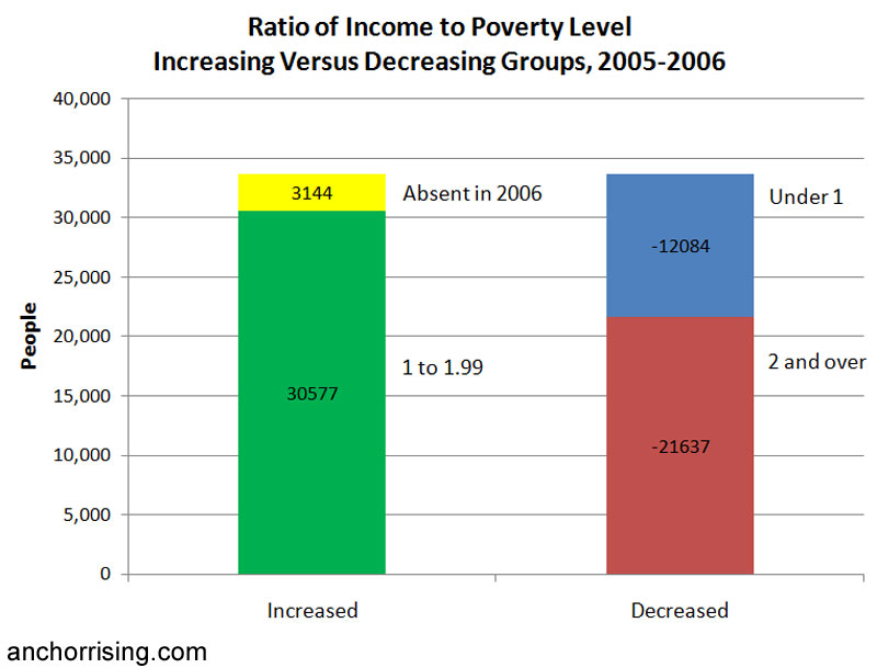
The blue segment of the “Decreased” column shows that, indeed, 12,084 fewer people live in households with income below the relevant poverty level. The unfortunately corresponding fact is that the red segment represents the 21,637 fewer people whose households make over twice the poverty level. And these two drops equate almost exactly with the 3,144 fewer people in the total plus the 30,577 more people with households just over the poverty level. In other words, it would be fair to say (albeit in a rough way) that the economic system that succeeded in pulling a good number of people out of poverty came with the cost of dragging almost twice as many people toward it.
To get a better sense of who, precisely, was gaining and losing in this trade-off, I plotted varying family types (married versus unmarried, with and without children) on line graphs corresponding to their household incomes. Although there were some interesting shifts in the data, from 2005 to 2006, it didn’t appear that they crossed the above ratio lines in any significant degree, most being well above twice poverty or well below poverty. One possible reason for that unexpected finding would be if smaller families were doing better, while larger families have fared worse, blurring the movement of individuals as represented in the ratio chart. The way poverty levels work, for example, a divorce in a borderline family could actually result in an on-paper elevation of one spouse and the children. Or a third income, from a working son or daughter, could disappear if he or she no longer counted as a child.
So what’s going on under the poverty level?
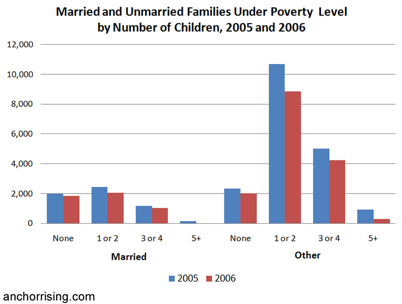
The first thing to note, as I jump into this series of charts, is that it’s very difficult to make generalizations. It goes beyond my time (and interest) to attempt to distill, say, retirees from newlyweds or growing families from economically declining ones. The movement of actual families could be all over the place. But in a general way, it’s reasonable to observe that the trend was out of poverty for all family types and sizes, but that unmarried families with children did a lot better. Perhaps the married families on this chart have more intransigent problems. Or perhaps unmarried families are having more children (thus rising above poverty… again on paper). Or maybe Rhode Island’s welfare system favors the unmarried.
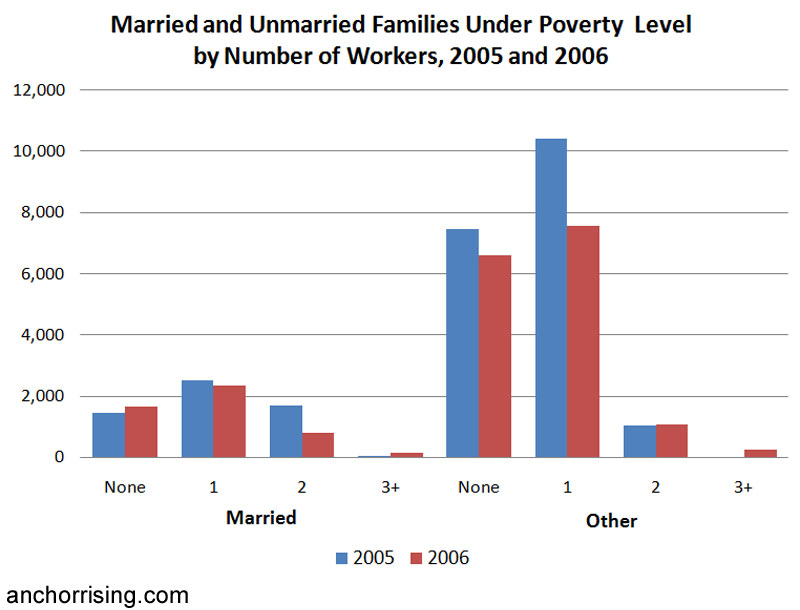
A glance at impoverished families by the number of family members working suggests that the trends might be healthy. (I’d count it as unhealthy, for example, if the number of families under poverty with low numbers of workers were increasing.)
Now, what about over the poverty level?

It’s difficult to make generalizations about this data, although there’s certainly nothing to disprove theories crediting our aging population for the shifts in income distribution. The increases in married couples with no children and with three or more, along with the slight decrease in married families with one or two children, would be consistent with older couples and growing families. I’d note, however, that the largest increase was among unmarried families (which includes cohabitors and single parents) with one or two children. That would be consistent with the trend of poverty-level divorces that I noted, or perhaps with increasing generosity to non-nuclear families.
As for workers:

Of these four mildly helpful charts, this offers the most food for thought (or further research). For one thing, the increase in married families with one worker suggests that more families might be living on one income, as the price of childcare makes a second income less attractive. On the whole, I’d take that as a positive development. On the other side of the ledger, though, it’s discouraging to the taxpayer to find that there are actually more unmarried families with no workers on this chart.
But having gone through the trouble to research this data and feeling unsatisfied at having only meager grounds for general hypothesizing, I thought to mix my two types of data:

A bit more can be said of this. Note that, when broken out by families, rather than people, more have risen out of poverty than fallen closer to it. It may be that smaller families are improving while larger ones are sinking after all. It’s downright disconcerting that married families with children fell out of the top group at the greatest rate, while unmarried families with children slid into it at the greatest rate.
Lest anybody with social views different than mine protests that I’m making too much of this mere transition, a more granular representation of the data from the first chart of this post illustrates that it is not an even trade:

What this shows is that the change at the edges is more drastic than pictured above. We’re not, in other words, merely talking working class people slipping past an arbitrary 2 x poverty line to help the poor slip above a less arbitrary poverty line. We’re talking about a much more precipitous drop among those above what might be thought of as a comfort line. Believe me that I deal with enough very wealthy people to know how that previous sentence sounds, but we’re not talking the ultrarich, here. We’re talking about a family of four (two children) that earns around $60,000–100,000 per year.
If one were to form a prognosis from this information, I can’t see that it matters much whether “comfortable” families have plummeting resources, divorces are splitting incomes, or some other cause is to blame. This is the range of income in which families move from just getting by, with some hope of a reasonable retirement, to having enough money to put it to good use in the economy. It’s also a key range in the collection of the taxes that weave the tenuous safety net helping those toward the bottom, and although I’m making a guess based purely on personal experience, it likely lies around some sort of threshold at which it becomes relatively easy to pack up and leave.
Justin,
5x the poverty level for a family of four is about $100k. Do I interpret your last chart correctly to mean that RI has lost about 25,000 people in this category? If that’s the case, it’s dynamite, and you might want to let Linda Katz in on the news.